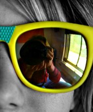
Every week for the Vero Beach 32963 newspaper I shoot for Arts, People, Health and Real Estate sections in addition to the bevy of news stories at the front of the paper. Each of those sections gets it's own magazine-style cover that runs as a full-page, vertical photo. At every assignment I shoot I've always got it in the back of my mind to make sure that I get a "cover" shot to run. It's got to be something that will look good and sharp at 12 x 15 inches (which is a pretty big photo) with room to fit text. Shooting a vertical real estate photo every week poses unique issues (I've always got my fingers crossed for high ceilings) and sometimes the health story for the week really doesn't lend itself to obvious art, but that hole is always there to fill. The upside is that I get lots of practice turning my camera on its side. Here are some of the "covers" from the last few months. Some of the photos may look familiar. If anybody has been paying really close attention to the blog (ha) and ever thought "it's odd that he seems to shoot so many vertical real estate photos" well, here is the reason.
Tuesday, November 22, 2011
Rotate, Add Text
Photos by
Tom McCarthy Jr.
at
3:28 AM
0
comments
![]()
Subscribe to:
Comments (Atom)

